Illustrator Search.

My illustration class assignment is a self portrait, in which I must choose an artist and draw myself in his/her style. The professor wants us to “think how they think”. Below are some works I’ve been looking at to consider for my self portrait, I wonder if my professor wil allow me to have multiple limbs or something. Probably not, but its an idea.

Dmitry Rebus Larin:

I really enjoy the proficiency of these illustrations. You can see these really sharp forms through watercolor.  I love the contrast with the use of black, and the slight appearance of line gives it more of a graphic appeal.


Oaky-oh:

I haved the pleasure of enjoying Okay-oh’s drawings for quite some time now.  They are so intricate, and the lines are often super-fine.  The subject matter is typically something imaginative, and not your typical fantasy drawing, and you can see a sort of, almost native american feel on the patterns of some clothing.

And of course, it helps to be in history of illustration:

Arthur Rackham:

I love linework, especially the swooshing lines of Arthur Rackham.  I feel that great line work is one thing what separates a painter from a graphic artist (and I did say ONE thing, as their are other differences).  But I love the black lines on top of the colors.

Aubrey Beardsley:
So you must know that I have a thing for line work in graphic art, and I have an inclination towards the use of black (Graphic Black, uh-huh?).  What I haven’t told though, is that I’m mesmerized by Illuminated manuscripts, and this illustration for The Death of Arthur by Beardsley, seems to have combined all those elements together.

And  Surprise surprsie Jules Cheret:

Some would see this and immediatley think of Toulouse-Lautrec, and I have nothing against him, I like him, but I must say Cheret (in my opinion) is up there with him.  Look at the action in these dresses he does on the lithographs, its gutsy.  I love his choice of colors, and his combination of warm and cold colors, and of course..big splashes of black.

That’s it for now, I’ll be showing my progress with this project via twitter, and speaking of progress, my robot series is nearly complete.

Something to deliver / Activation Pt.3

So my super awesome former co-worker, Junli Kato posted about me on her blog. If you come to my blog because of her, awesome, if you come to my blog not because of her, you should check her blog, it’s awesome, and she’s a superb designer (not fluff, I worked with her, I know).

I’d figure I’d give you an update on stuff I’m trying out lately. I’m trying to enter the Adobe Imagination Challenge, there are four periods for me to enter, I intend to enter all of them. And I’ve entered this fellow just yesterday, you may remember a robot spider I’ve made, he’s back:


This is for my series of robot posters I started working on over the summer, dubbed “The Skinmetal Series”. I’m only 2 away from finishing, I blame school for delaying me, but you may see some of my school projects very soon.

I’ve started printing it, the second screen will be printed next week, here’s the progress:

The Prince First Color

The Prince Second Screen

If school permits me I should be posting up some more stuff soon.  Until then!

Twitter!

Hello everyone, you’ll notice I haven’t been posting regularly. I was out for a week in Miami, and I’m trying to finish the Vectorbots series before the end of August, I’d like to submit it to a contest on Behance. BUT, I will be regularly posting pictures on my twitter. They’ll be relating to my trip and WIP screen captures of the robots.

So go check to my twitter: umbrapenumbra

Activation Pt. 2

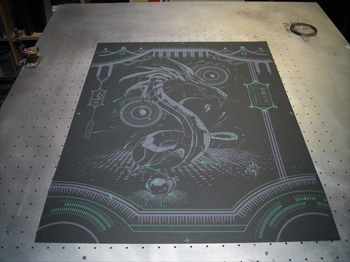
A couple Saturdays ago my friend Castro and I got permission to print some personal projects at Lure Design Inc. I showed you on my last Activation post which robots I would be printing next, and Metal Ember (the oriental dragon, not expecting you to know names), was going to be next on the list, being the first robot I drew I felt that it should be the next one printed.

I burned both screens first thing that morning.
Corrupt Jade Screen

Then after the first pull I realized that I had left the film under the screen, I wanted to hit myself (I did get it pretty nicely registered though!), but that was a little blunder compared to what I figured out when I was doing a few more pulls.  I burned the screen backwards!  Luckily, I managed to burn BOTH screens backwards, so I was still able to get a limited edition of some prints.

I had purchased a jar of red Permaset Supercover ink for this, but I didn’t want to waste it on a misprint, so I made a couple prints on green, with a little blue mixed in.  I’m calling it the Corrupt Jade Edition.  It is an Edition of 5.

The next Saturday I made sure I burned Metal Ember correctly:

Red Permaset is really, really bright, like a computer screen, I was very happy with the results:

But not only was I printing Metal Ember, but Missile Breath as well:

I was still giddy about the red Permaset, so I made a limited red edition of Missile Breath:

I should have a sneak peak of what I’m working on soon.  You should follow Umbrapenumbra on twitter (’tis me), I like doing quick little sneak peaks on there.  Until next time!

FAFF 8 : Erin Creative Design

There is kitty snoring beneath my bed, which is perfect for this week’s feature! Erin Fonzi was treasurer for the Graphic Design Student Association at UCF last year. I know her from the GDSA and from taking Printmaking with her, and her combining of soft-ground etchings, scanned and then colored digitally are pretty sweet if you ask me. If you like design, Go check her work! Here’s some of my faves:

Thieving Thursday 6

So i’ve recently discovered a great site featuring poster art, and I LOVE POSTER ART. The site’s called Flyer Goodness, here’s a couple I’ve seen that have caught my eye:

Strong Stuff:


Adam Velcro:


Kent Hernandez”

Silent Giants

Activation pt.1

I just got back today from printing two posters from my robot series and 100 Charity at Lure Design Inc (where I am currently a screen printing intern).  My friend Ali Castro photo documented all of it, along with helping me print, burn, recliam, etc.  Today we burned(and printed) the following:

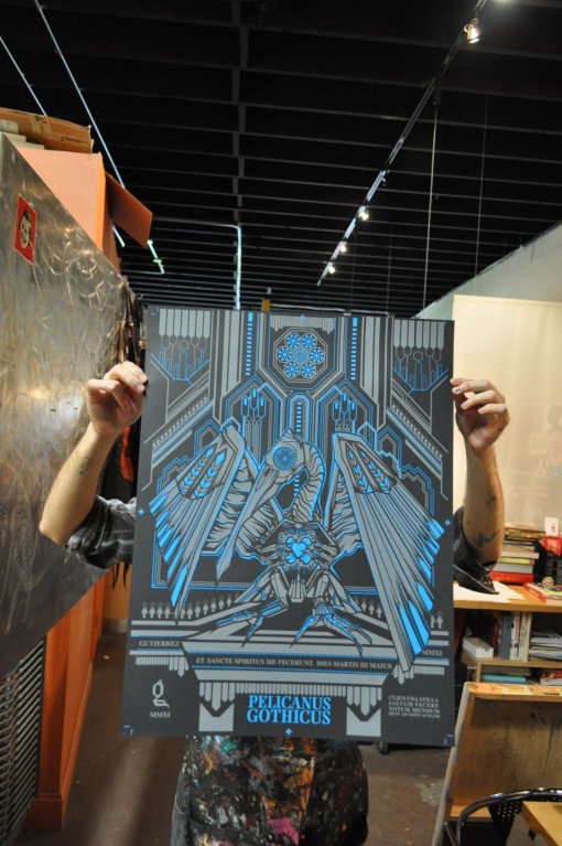
And I forgot to take a picture of the film for Pelicanus Gothicus , but Castro took care of that issue:

Not yet alive.  This is the first color for Pelicanus Gothicus

Cleaning up the screen used to print the color you just saw.

Screens look cool with the sun light coming from from behind.

Look who’s turn it is!

Attaching an arm to register for Apotropiac Grotesque….and dang it I just noticed that typo.  I’m inventing a word everyone, it means the same as apotropaic, apotropiac.  Wow…I’m a little perturbed now.  Oh well.

Registering the second color for Pelicanus Gothicus.

Screens for 100 Charity.  It’s really 2 colors.  I had one of those “learning experiences” with one of the screens.

And for next time…

FAFF7: Studio Stasi

It’s time for Fridays are For Features again! I’m actually surprised I haven’t mentioned the design skills found at Studio Stasi. It’s a nice blend of fun and professional.  I know Stacey from the University of Central Florida, as she was Vice President of the Illustration Student Association (and has a great logo for it in her portfolio too).  Studio Stasi is two people though,  and all in all, both Stacey Woods (soon to be Stacey Baldini) and Tony Baldini make an awesome design-duo.

Here’s a favorite:

Stacey Woods

Oh and another thing they have going for them is their use of social media, I actually went to a presentation on social media held by Stacey, and it was excellent.  You can find them both on twitter, linked-in, or right here.

Thieving Thursday 5.

I’ve been bad and not blogging..very bad. So for the this installment of my supposed-to-be-weekly twitteresque (but not really), theiving thursday post, I’m taking from Smashing Magazine.  Click that link to check out some CD Covers.

One of my favorite things to design are CD covers, the whole package really. This page has several CD Covers that I particularly enjoy, below are some of my favorites from the post, and some of my favorites off the top of my head.

Postal Service CD Cover

Really I enjoy the soft color palette of the photo, and the typography is nice and clean.

Massive Attack CD Cover

I have a thing for beetles, and this macro shot of a black beetle against the white produces a nice contrast. I enjoy the white type as well.

Dead By Sunrise CD Cover

This one isn’t on Smashing Magazine’s list (but I’m sure if they saw it, they’d put it in) Just as I enjoyed the black mass that was a beetle on the last one, I enjoy the black here too, as well as the shapes.  I feel like red is the “sprinkles” of colors, often I’d find myself with a color scheme and finding myself enjoying it with little bits of bright red mixed in.

The Resistance CD Cover

This wasn’t on there either.  Bright colors so you think I’m only  for black and white.  The circle is one of my favorite shapes,  I really enjoy the circular composition, as well as the pattern and colors.

Blue Sky Noise CD CoverLast of one of my favorite album covers.  Just as aI love circles, I also love diagonals in compositions.  I like the bursting rainbow coming out of the monster, and the slants on the landscapes, and overall the technique is great.  I believe I was looking at the website of this artist, and this I think is painted traditionally.

Corpus Christi & Pelicanus Gothicus

I was just going to take this moment to show a piece of my robot series, this won’t be a “preview” version though. This time I’ll show off an entire, finished piece, and if God wills it, you’ll see a screen printed version soon as well.

But first, I have to apologize for missing my usual Thursday and Friday post, I was a tad occupied, and sleepy.

Now back on topic. Most of you know that I’m Catholic, well, today is the Solemnity of Corpus Christi. Translated from Latin it literately means “Body of Christ”. But we don’t only celebrate the Body of Christ, but His Most Precious Blood as well, we do this every time we partake in Holy Communion, but today’s extra special because it’s the Solemnity.

What am I getting to? Well, if you recall my robot series is ALMOST entirely meaningless. I started it because there was a class at UCF that was going to be making robots and dragons, and I wasn’t in that class, so I decided to push myself into making a series of my own. Really it was only to improve my illustration and design skills. I could almost say it is supposed to be more visual than conceptual. Keyword almost. I’ll get to the point:

Pelicanus Gothicus

Pelicanus Gothicus

Remember Gothic Pelican? Yes I changed its name to Latin, and no this isn’t the correct version, but it’s 2 steps away from the actual final (it’s supposed to say Pelicanus Gothicus.) The Pelican is often seen as an Iconographic Symbol for Christ. The legend is that a mother pelican would strike at her breast until it bleeds in order to feed her children, which can be related to “This is my blood of the covenant, which is poured out for many for the forgiveness of sins.” (Matt 26:28). But instead in going with the Biblical quote, I went with part of the Hymn “Adoro Te Devote” (by St. Thomas Aquinas.) It reads:

“Cujus una stilla salvum facere
Totum mundum quit ab omni scelere.”

Which translates to:

“One drop of which can free
the entire world of all its sins.”

So for a few of these, there is slight meaning behind them.  Mainly when I start using Latin.